Probably the first way a lot of readers will interact with a book is through the cover. Even in today’s online world where the covers are thumbnail images much smaller than a cover you would browse in the bookstore or library, the cover is still so important in creating the first impression of what’s inside. Genre blended books have a lot of challenges when it comes to marketing, including what cover to put on the book. Do you emphasize one genre? Another? Go for something neutral? One of the good things about the change we made with the Genre Blender to host cover images locally rather than serve them from Amazon is that I got to choose which cover to include in the database. For all the titles here I saw the first cover served up and said….nope, that’s not it. Sometimes it was because the cover was different from the one on my shelf, but sometimes the covers were surprisingly, completely different from what I expected, knowing what was inside the cover.
Less Genre-y Covers
Publishers sometimes change a genre over different editions to try to attract different audiences to a title. Here are a few covers that started out more obviously genre and end up with fewer genre cues on the cover, perhaps to make them an easier sell to non-genre readers.
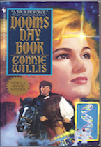
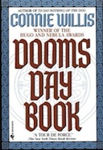
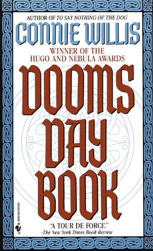
Doomsday Book by Connie Willis
One of my favorite genre books, this is the first of Connie Willis’ fantastic time travel SF/Historical blends. The premise is an Oxford researcher from the near-ish future travels back to the 14th century to study life in medieval England but misses her target dates and ends up in the plague years. Great stuff, and dated though it may seem the first cover does get that future/history mashup across in a simple way — futuristic car, medieval cloak. The second cover is from my person copy and, just…wowza. I have no idea what’s gong on with this cover. The marketer did not read the book, that’s for sure. It looks like a romance, maybe? But with a little science crammed in the corner? Frankly, it just makes me giggle. So wrong. And the third cover is what it has been sold with in all recent editions. Clean and classy, but not particularly genre-y? I know it would certainly be easier to hand sell than my copy!


Zoo City by Lauren Beukes
OK, so I want to tread lightly here and not make this about the fact that they took a cover with two people of color and went for a more abstract cover. There has been a lot of controversy over “whitewashed” covers. The original cover is more of an urban fantasy cover, but I like the colors and the way they worked the animals into the pictures. The new cover, is stark black and white, but I actually think it is hugely eye-catching. They way the cover designer used the animals in the title. I think it would be fair to say that the new cover would be much more of an easy sell to non-genre readers. Beukes gained a lot of readers with her genre-bending thriller The Shining Girls, and it was a nice effort to get new fans to try her older book. It’s one of my all-time favorites, so anything that gets it into more hands is worth trying. But it is rare enough to have diversity in fantasy characters, so it’s a shame that gets lost with the new cover.
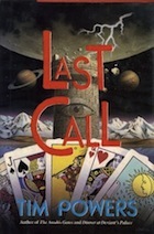
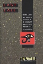
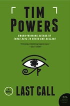
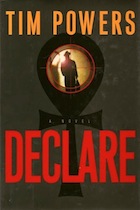
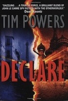
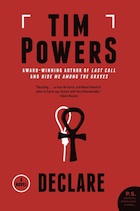
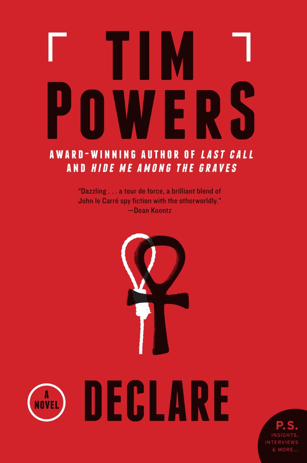
Last Call: A Novel and Declare by Tim Powers
I really like Tim Powers. His books are always different, always challenging, and combine genres in unique ways. Last Call is a genre-defying father-son conflict with the poker scene of Las Vegas as a backdrop. Declare is a spy thriller with an occult edge. Both combine suspense and fantasy in super cool ways, and their covers have run the gamut. I love the first cover for Last Call — very eerie, with a Tarot deck (important to the story). The second cover just pulls out a stylized Egyptian-looking Eye of Horus (why? – if I remember the mythology of Last Call it is more FIsher King than Pharaoh). Declare actually started with a fairly thriller-ish cover then got more genre-y for the paperback. And the final covers for both books shows a very simple unified look that the publisher is giving the re-issues. Although I like when series or runs of an author have a thematic link, these are a little too simple for me.
Media Tie-in Versions
I almost ALWAYS hate the media tie-in covers, I must admit. But here are a couple of especially bad examples where the book suffers from having this kind of marketing.
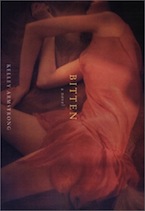
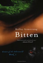
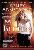
Bitten by Kelley Armstrong
I adore this book, and owned it in the far left version until I loaned it to someone and never got it back. It’s still my favorite, although the middle paperback is fine as well. Book the tie-in! Ugh. generic UF cover with tight clothes, skin showing, hair blowing in invisible wind, indistinct background with supernatural creature poking out. I like the first cover, MY cover, because it is sensual without being cheap, and it’s flat-out pretty.
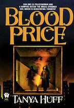
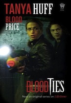
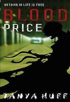
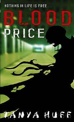
Blood Price by Tanya Huff
Although the original DAW cover is not super-exciting, the TV show tie-in is just awful. It looks like something screen grabbed from a VHS tape. Too dark, out-of-focus, and…is that a nerf gun? Bonus, the publisher Little Brown now looks like they have a teen edition. I don’t really get the teen appeal (this is a pretty straightforward urban fantasy with a strong mystery in each volume, featuring a former PI and a centuries old vampire) but it’s an eye-catching cover design that carries through to the other volumes in the series.
 Outlander
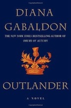
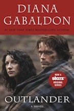
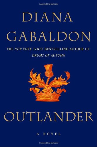
 by Diana Gabaldon
This is an interesting case. Although this novel is hugely romantic, it has never been given an explicitly romance cover, until the TV tie-in. The first cover, from the 1991 original hardcover could pass for a romance, I suppose (there was a big trend in still life-type covers in romances for a while), but it could also be slipped on the historical fiction shelves with ease. The second cover, which the book has had for most of the 23 years since it came out, is very stark and frankly doesn’t really scream any genre at me. But when they were issuing the tie-in, we get the romantic couple, front and center with Jamie all protectively encircling Claire. I guess they think the romance fans are the ones watching the series and then going back to the books.
Kindle/ebook versions
Ugh. The kindle covers that get slapped on books. Don’t get me wrong, I’m glad that books that are harder to find in print are readily available for the kindle or other ebook providers. I’m a huge fan of ebooks. But oy… the covers.
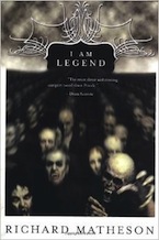

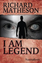
I Am Legend by Richard Matheson
Isn’t that third one just awful? And yet, if you shop the kindle store, that is the cover you see. This book is about the last man alive after a vampire plague but I don’t know what the hell that cover is about. It also got the movie tie-in edition treatment, with Will Smith striding through a shadowy landscape. But my favorite is still the paperback on the left. Menacing, stark, and scary.
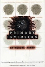
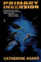
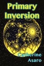
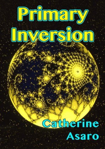
Primary Inversion by Catherine Asaro
The Skolian empire books are fantastic (there’s a new one coming in January – YAY!!), and had actually never seen the hardcover for the debut novel before I wrote this post. Even blowing it up, I still have no real idea what they were going for here. It’s not particularly eye-grabbing. The second cover is the one most people are probably familiar with. Sleek starships, a hint of conflict — not bad. I don’t blame Tor for not stressing the romantic elements of the plot, but believe me, there is some good angsty love there. But ye gads the Kindle cover. It’s just hideous. The font, the colors. Just because an ebook has a smaller thumbnail cover doesn’t mean you can just throw any crap on the book and people will click on through. I feel bad for this book — it just doesn’t deserve such treatment.
Foreign versions
(I actually usually love the foreign versions of books, but there is always an exception)
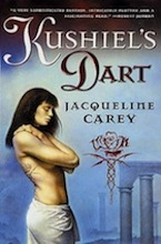
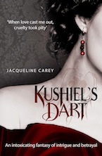
Kushiel’s Dart by Jacqueline Carey This is absolutely one of the best fantasy books I’ve ever read. I’ve actually never liked the cover on the US version for a really silly reason that I think it makes Phèdre look funny and I don’t like her bangs. Courtesans shouldn’t have bangs. (And yes, those who know me IRL are aware that I have bangs, but I know my own limitations). But it looks like an epic fantasy book, so fine. This is grand epic fantasy, with politics, physical and emotional quests, amazing worldbuilding and a love story that’s as tortured as anything in literature (pun intended). The second cover is the UK kindle cover and I hate it. It’s pretty enough, but it looks like vampire soft porn. The tattoo is wrong (so wrong — it’s not on her neck, it’s on her back and it’s not an effing hibiscus. Really, the tattoo is important), the font and the color scheme and the angle of her neck all make me thing vampire paranormal romance. The cover copy all backs up the impression. “When love cast me out, cruelty took pity” is a direct quote, and I never recommend this book without mentioning the sensuality of the book and the torture-y bits, but putting it on the cover makes this seem like that’s all the book is. I actually don’t think I put this book in the blender as Fantasy/Romance because the romance is so broken and awful and wonderful and sad. And this cover is all about the romance look. So yeah, I hate that cover.